-
Shop
- Adidas
- Advanced Technologies
- AI Skills Mastery 2026 Collection
- Astrology & Tarot Products
- Beauty
- Beauty Guides Collection
- Best-Sellers
- Car Accessories
- Confidence
- Dating & Social Skills
- Digital Resources
- AI & Technology
- AI Skills
- Budgeting & Saving
- Car Buying & Ownership
- Cozy Feast Collection
- Electronics & Technology
- Emotional Intelligence
- Entrepreneurship & Business Growth
- Financial Education
- Financial Independence
- Financial Mindset & Psychology
- Goal Setting
- Hobbies
- Home Styling & Organization
- Kitchen & Recipes
- Leadership
- Mindfulness
- Mindset
- Motivation
- Online Business
- Parenting & Child Development
- Pet Lifestyle & Wellness
- Positive Thinking
- Productivity
- Self Confidence
- Sleep Improvement
- Smart Life with AI
- Stress Management & Relaxation
- Travel Planning
- Yoga & Fitness
- Yoga & Mind-Body Practices
- Education & Learning
- Family & Parenting
- Fashion
- Alexander McQueen
- Bags
- Bags & Wallets
- Balenciaga
- Belts
- Blazers
- Bottega Veneta
- Brunello Cucinelli
- Burberry
- Chanel
- Chloé
- Dior
- Dolce & Gabbana
- Dresses
- Etro
- Fendi
- Gucci
- Hats & Hair Accessories
- Hoodies & Sweatshirts
- Jacquemus
- Jil Sander
- Keychains
- Kiton
- Luggage
- Miu Miu
- Off-White
- Outerwear
- Prada
- Rick Owens
- Saint Laurent
- Shoes
- Socks & Tights
- Sweaters & Cardigans
- The Row
- Tom Ford
- Tops & Shirts
- Valentino
- Valentino Garavani
- Versace
- Vivienne Westwood
- Watches
- Fashion Accessories
- Furniture
- Gadgets
- Health & Beauty
- Health & Wellness
- Home & Garden
- Home Supplies
- Jewelry
- Kids & Babies
- Kitchen
- Kitchen Best-Sellers
- Nike
- Patio, Lawn & Garden
- Personal Growth
- Personal Style & Fashion
- Pet Care
- Pet Supplies
- Pets
- Smart Home Living Guides
- Sport & Outdoors
- Stress Relief & Relaxation
- Super Deals
- TikTok Growth & Monetization Mastery
- Travel
- Travel & Adventure
- Wealth
- Wellness
- Popular
- Best deals
Choose Wall Art to Change the Mood in Every Room
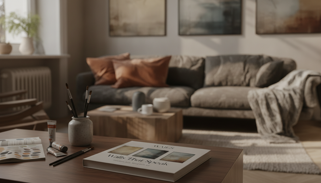
Walls That Speak: Transform Your Mood with Art
A room’s atmosphere is shaped by what the eyes meet first—color, contrast, and imagery at wall level. With a few intentional choices, wall art can support calm in a bedroom, focus in a workspace, or warmth in a gathering space. This guide breaks down how mood cues work, how to choose art by emotion (not just style), and how to place pieces so the effect feels natural rather than staged.
Why wall art changes the way a room feels
Walls take up a large share of your visual field, so the artwork you hang becomes part of the room’s “emotional background.” Your brain processes visual cues quickly—especially color temperature, brightness, contrast, and subject matter—so the right piece can gently raise energy, soften stress, or make a space feel more welcoming.
- Baseline mood comes from the biggest shapes. Large pieces (or a dominant gallery cluster) set the emotional tone first; smaller works and objects fine-tune it.
- Subject matter nudges your nervous system. Open horizons, simple forms, and nature imagery often read as spacious and calming; busy compositions can feel lively and stimulating.
- Personal meaning beats trends. Familiar places, symbols, or memories typically land deeper than whatever is “in” this season.
- Harmony reduces visual friction. Repeated tones, consistent frame finishes, and even spacing can make a room feel settled—an underrated comfort cue.
For a deeper, step-by-step approach to shaping mood with art choices, see Walls That Speak: Transform Your Mood with Art (digital guide).
Color psychology made practical (without overthinking it)
Color psychology isn’t about rigid rules; it’s about predictable tendencies. The American Psychological Association’s overview of color psychology highlights how color can shape perception and emotional response. Use these ideas as guardrails, then adjust for your home’s light and your own preferences.
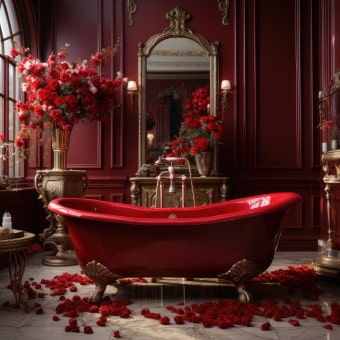
- Warm colors (reds, oranges, warm neutrals) read as social and energizing in balanced doses. Very saturated warm palettes can feel restless in spaces meant for rest.
- Cool colors (blues, greens, soft grays) tend to feel calm and airy. Deep cool tones can feel intimate and moody—great when you want a cocoon effect.
- Neutrals still have “temperature.” Pink-beige, olive-taupe, and blue-gray undertones quietly steer mood even when the palette looks subtle.
- Contrast controls intensity. High contrast boosts drama and attention; low contrast supports continuity and recovery.
- Try 60–30–10 for the wall story. Let the room’s dominant background tone be 60, supporting tones in key pieces be 30, and a small accent color be 10—then repeat that accent 2–3 times in the room.
Mood map: colors, subjects, and best-fit rooms
| Mood goal | Color family & intensity | Art subjects/styles that reinforce it | Where it works best |
|---|---|---|---|
| Calm & recovery | Soft blues, sage greens, gentle neutrals | Minimal landscapes, watercolor abstracts, slow gradients | Bedroom, reading nook, bathroom |
| Focus & clarity | Cool neutrals, muted blues, limited palette | Geometric prints, line art, typographic minimalism | Home office, study corner |
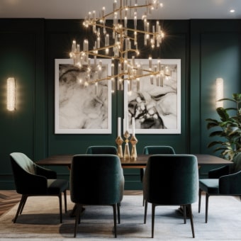
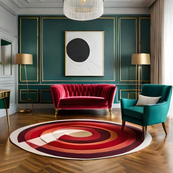
| Warmth & connection | Terracotta, warm beige, amber accents | Figurative sketches, cozy interiors, sunlit photography | Living room, dining area |
| Energy & creativity | Coral, mustard, bold mixed palette (controlled) | Pop art, playful collage, expressive abstracts | Studio, entryway, teen room |
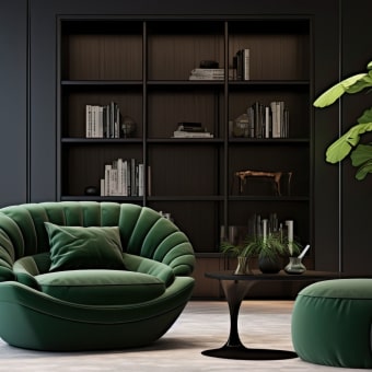
| Grounded & cozy | Earth tones, deep greens, charcoal accents | Botanical prints, textured art, nature photography | Den, lounge, hallway |
Emotional design: choosing art by feeling first
Great rooms don’t just “match”—they support a feeling. Emotional design focuses on how people experience an environment, not just how it looks. (For background, see the Interaction Design Foundation’s overview of emotional design.)
- Pick the primary emotion the room should support most days. Rest, focus, optimism, comfort, or creativity—choose one as the anchor.
- Match the pace of the imagery to the pace of the feeling. “Slow” moods pair well with airy compositions; “fast” moods pair well with dynamic layouts.
- Fast-feeling art cues: sharp angles, high contrast, busy compositions, intense saturation.
- Slow-feeling art cues: soft edges, open space, gentle gradients, repeating calm patterns.
- Build an emotional storyline through the home. Entryway = welcome; living room = connection; kitchen = energy; bedroom = restore.
- Shared spaces can still feel personal. If tastes differ, choose neutral-dominant art and add a small accent color you both like (then echo it in decor).
Placement and scale tricks that make the mood stick
If your art looks harsher than intended at night, consider adding a dedicated wall light. The Luxury Retro French Romantic Copper Crystal Wall Lamp can create a warmer, more flattering wash that helps art feel inviting rather than stark.
Room-by-room mood recipes
Bedroom (restore)
Living room (connect)
Home office (focus)
Entryway (arrive)
Hallways (steady rhythm)
A simple 15-minute refresh plan
FAQ
What colors are best for a calming bedroom wall art palette?
Soft blues, sage or olive greens, and gentle warm neutrals tend to feel restful—especially when the artwork stays low-contrast and the imagery is simple (like minimal landscapes or soft abstracts). If sleep is the priority, avoid placing highly saturated reds and oranges near the bed, since they can feel more energizing than soothing.
How do you choose the right size wall art above a sofa or bed?
A reliable guideline is to choose art that’s about two-thirds the width of the sofa or bed (or use a balanced set like a triptych or a coordinated gallery row). For placement, aim to center the arrangement around 57–60 inches from the floor, then fine-tune so it visually connects to the furniture rather than floating too high.
Can lighting change the emotional effect of wall art?
Yes—warm bulbs can soften contrast and make colors feel cozier, while cooler bulbs sharpen lines and increase a sense of crispness and alertness. Directional lighting (like a picture light or wall sconce) also helps control glare and can either amplify drama or create a calmer, more even look across the artwork.


Leave a comment