-
Shop
- Adidas
- Advanced Technologies
- AI Skills Mastery 2026 Collection
- Astrology & Tarot Products
- Beauty
- Beauty Guides Collection
- Best-Sellers
- Car Accessories
- Confidence
- Dating & Social Skills
- Digital Resources
- AI & Technology
- AI Skills
- Budgeting & Saving
- Car Buying & Ownership
- Cozy Feast Collection
- Electronics & Technology
- Emotional Intelligence
- Entrepreneurship & Business Growth
- Financial Education
- Financial Independence
- Financial Mindset & Psychology
- Goal Setting
- Hobbies
- Home Styling & Organization
- Kitchen & Recipes
- Leadership
- Mindfulness
- Mindset
- Motivation
- Online Business
- Parenting & Child Development
- Pet Lifestyle & Wellness
- Positive Thinking
- Productivity
- Self Confidence
- Sleep Improvement
- Smart Life with AI
- Stress Management & Relaxation
- Travel Planning
- Yoga & Fitness
- Yoga & Mind-Body Practices
- Education & Learning
- Family & Parenting
- Fashion
- Alexander McQueen
- Bags
- Bags & Wallets
- Balenciaga
- Belts
- Blazers
- Bottega Veneta
- Brunello Cucinelli
- Burberry
- Chanel
- Chloé
- Dior
- Dolce & Gabbana
- Dresses
- Etro
- Fendi
- Gucci
- Hats & Hair Accessories
- Hoodies & Sweatshirts
- Jacquemus
- Jil Sander
- Keychains
- Kiton
- Luggage
- Miu Miu
- Off-White
- Outerwear
- Prada
- Rick Owens
- Saint Laurent
- Shoes
- Socks & Tights
- Sweaters & Cardigans
- The Row
- Tom Ford
- Tops & Shirts
- Valentino
- Valentino Garavani
- Versace
- Vivienne Westwood
- Watches
- Fashion Accessories
- Furniture
- Gadgets
- Health & Beauty
- Health & Wellness
- Home & Garden
- Home Supplies
- Jewelry
- Kids & Babies
- Kitchen
- Kitchen Best-Sellers
- Nike
- Patio, Lawn & Garden
- Personal Growth
- Personal Style & Fashion
- Pet Care
- Pet Supplies
- Pets
- Smart Home Living Guides
- Sport & Outdoors
- Stress Relief & Relaxation
- Super Deals
- TikTok Growth & Monetization Mastery
- Travel
- Travel & Adventure
- Wealth
- Wellness
- Popular
- Best deals
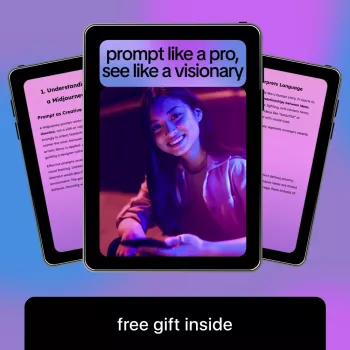
Midjourney Prompt Structure for Consistent Cinematic Images

Text-Instruction Mastery for Midjourney: A Creator’s Guide to Getting Consistent, Cinematic Results
Clear text instructions turn random outputs into repeatable visuals. When the instruction is structured—subject, style, lighting, composition, and constraints—Midjourney becomes less of a slot machine and more of a controllable image tool. The goal isn’t “more words.” It’s better decisions: what must appear, what must not, and which visual variables stay constant so a series looks like it belongs together. For more guidance, see 15 Tips to Help Your Midjourney Prompts | +Free Prompting Guide.
What Changes When the Text Instruction Gets Specific
Specificity shifts the result from “an interesting image” to a defined subject in a believable world. Naming the subject, setting, and mood reduces the odds of odd extras (random hands, floating objects, stray text) and makes variations feel like true alternates rather than unrelated images. For further reading, see Midjourney prompts guide (2026) with V6 & V7 Tips – Printify.
- Moves from “interesting image” to a defined subject, setting, and mood
- Reduces unwanted artifacts by naming what must be included (and what must be excluded)
- Improves consistency across variations by keeping a stable visual brief
- Makes iteration faster by changing one variable at a time (camera, palette, era, material, lens, etc.)
For parameters and syntax, it helps to keep Midjourney Documentation nearby, plus the official Midjourney Quick Start when setting up repeatable workflows.
The Core Formula: Subject + Context + Style + Camera + Finish
Think of the instruction as a visual brief with five layers. Each layer answers a different “why does it look like this?” question.
- Subject: who/what is the main focus (include age, materials, shape language, key identifiers)
- Context: location, time, weather, cultural cues, props, background action
- Style: art movement, medium, designer references, illustration vs photo-real, realism level
- Camera & composition: shot type, lens feel, perspective, framing, depth of field, focal point
- Finish: lighting setup, color palette, texture, grain, post-processing, mood descriptors
- Practical constraint: aspect ratio, quality, stylization level, and other parameters used consistently for a series
Instruction Elements That Increase Control
| Element | What to specify | Example phrasing (adaptable) |
|---|---|---|
| Subject | Identity, materials, defining features | “porcelain teacup with cobalt stripe, hairline cracks, steam rising” |
| Setting | Place, era, atmosphere, environmental details | “sunlit studio table, linen cloth, morning haze, minimal background” |
| Composition | Framing, angle, focal point, negative space | “top-down flat lay, centered hero object, generous negative space” |
| Lighting | Direction, softness, temperature, contrast | “soft window light from left, warm highlights, gentle shadows” |
| Finish | Color grade, texture, film look, sharpness | “muted pastel grade, subtle film grain, crisp edges” |
| Exclusions | What must not appear | “no text, no watermark, no extra cups, no hands” |
A Repeatable Workflow for Faster Iteration
Consistency comes from protecting your “known good” decisions. Build a baseline, test quickly, then refine in small steps.
- Start with a “baseline brief” that includes subject, setting, and a single style direction
- Generate a small batch, then evaluate only 2–3 criteria (composition, lighting, materials) before changing anything
- Adjust one variable at a time: swap lighting first, then camera, then palette—avoid changing everything at once
- Lock the successful parts into a reusable template, then branch into variations (seasonal, editorial, product, character sheets)
- Save winning instruction blocks (lighting recipes, lens recipes, palette recipes) as modular snippets
A practical way to do this is to maintain three mini “recipes” you can paste in: (1) a lighting recipe, (2) a lens/shot recipe, and (3) a house finish (grade + grain + contrast). When a scene fails, fix one recipe at a time instead of rewriting the entire instruction.
Common Failure Modes and How to Fix Them
- Overloaded description: too many competing styles—reduce to one primary style + one modifier.
- Ambiguous nouns: replace vague terms (“nice”, “beautiful”) with concrete visual properties (materials, era, color, texture).
- Unclear focus: add framing and focal point; name what is in the foreground vs background.
- Inconsistent series outputs: keep aspect ratio and stylization consistent; reuse the same baseline brief.
- Unwanted text/logos: explicitly exclude text, signage, watermarks, brand marks.
Mini Templates Creators Can Reuse (and Customize)
Product-style image template
Character concept template
Cinematic scene template
Editorial illustration template
Creator Kit: A Compact Guide for Better Results in Less Time
For creators who want a ready-made structure, a dedicated reference can speed up the “blank page” moment and reduce rework. The Midjourney text-instruction guide for creators is built around modular building blocks, templates, and iteration checkpoints—useful when you’re producing a set (covers, thumbnails, brand visuals, mood boards) and need cohesion across the whole run.
Need a tangible subject for testing product-style setups? A simple hero object like the Elegant 280ML Ceramic Coffee Cup with Saucer – Striped Latte & Tea Mug is ideal for practicing materials, reflections, and clean compositions without introducing too many variables.
When color harmony is the priority, a defined palette reference can help keep series work consistent. Deep Autumn Wardrobe Made Easy: Your Ultimate Guide to Deep Autumn Color Palette Clothing can inspire controlled warm grading choices (rust, olive, deep teal, chocolate) for a cohesive look across multiple scenes.
FAQ
How long should a Midjourney text instruction be?
Aim for a short baseline that clearly defines subject, setting, and finish, then add only details that reliably change the image (lighting, composition, lens feel, exclusions). Clarity beats length, and shorter instructions are easier to iterate without accidentally shifting the entire look.
Why do results look inconsistent even with similar wording?
Small changes in hidden variables—like aspect ratio, stylization level, or swapping multiple descriptors at once—can cause big visual drift. Reuse a stable baseline brief, keep key parameters consistent, and change one variable at a time while saving a reusable “house style” block.
How can unwanted text, logos, or extra objects be reduced?
Add explicit exclusions (no text, no watermark, no logos), tighten the subject definition, and simplify the scene so there’s less “empty” ambiguity to fill. Even with strong exclusions, a few attempts may still be needed, so keep the baseline consistent and iterate in small steps.
Recommended for you

Best Indoor-Only Pets for Small Spaces & Busy Owners
Jun 17, 2026


Leave a comment