-
Shop
- Adidas
- Advanced Technologies
- AI Skills Mastery 2026 Collection
- Astrology & Tarot Products
- Beauty
- Beauty Guides Collection
- Best-Sellers
- Car Accessories
- Confidence
- Dating & Social Skills
- Digital Resources
- AI & Technology
- AI Skills
- Budgeting & Saving
- Car Buying & Ownership
- Cozy Feast Collection
- Electronics & Technology
- Emotional Intelligence
- Entrepreneurship & Business Growth
- Financial Education
- Financial Independence
- Financial Mindset & Psychology
- Goal Setting
- Hobbies
- Home Styling & Organization
- Kitchen & Recipes
- Leadership
- Mindfulness
- Mindset
- Motivation
- Online Business
- Parenting & Child Development
- Pet Lifestyle & Wellness
- Positive Thinking
- Productivity
- Self Confidence
- Sleep Improvement
- Smart Life with AI
- Stress Management & Relaxation
- Travel Planning
- Yoga & Fitness
- Yoga & Mind-Body Practices
- Education & Learning
- Family & Parenting
- Fashion
- Alexander McQueen
- Bags
- Bags & Wallets
- Balenciaga
- Belts
- Blazers
- Bottega Veneta
- Brunello Cucinelli
- Burberry
- Chanel
- Chloé
- Dior
- Dolce & Gabbana
- Dresses
- Etro
- Fendi
- Gucci
- Hats & Hair Accessories
- Hoodies & Sweatshirts
- Jacquemus
- Jil Sander
- Keychains
- Kiton
- Luggage
- Miu Miu
- Off-White
- Outerwear
- Prada
- Rick Owens
- Saint Laurent
- Shoes
- Socks & Tights
- Sweaters & Cardigans
- The Row
- Tom Ford
- Tops & Shirts
- Valentino
- Valentino Garavani
- Versace
- Vivienne Westwood
- Watches
- Fashion Accessories
- Furniture
- Gadgets
- Health & Beauty
- Health & Wellness
- Home & Garden
- Home Supplies
- Jewelry
- Kids & Babies
- Kitchen
- Kitchen Best-Sellers
- Nike
- Patio, Lawn & Garden
- Personal Growth
- Personal Style & Fashion
- Pet Care
- Pet Supplies
- Pets
- Smart Home Living Guides
- Sport & Outdoors
- Stress Relief & Relaxation
- Super Deals
- TikTok Growth & Monetization Mastery
- Travel
- Travel & Adventure
- Wealth
- Wellness
- Popular
- Best deals
Spring Color Palette Checklist: Fresh, Easy Outfit Formulas
What “spring colors” really mean (and why they work)
Spring colors” aren’t just pastels or florals—they’re colors that read clear, warm-to-neutral, and light-to-medium in depth. The overall effect is brighter and more energized than winter dressing, with shades that feel crisp in daylight and easy to mix with lighter neutrals.
Color impact comes from three simple levers: temperature (warm vs. cool), value (light vs. dark), and chroma (soft vs. bright). Most spring-friendly palettes lean lighter in value and higher in chroma, so outfits look fresh without feeling heavy. For more guidance, see The 10 must-have fashion trends of the spring/summer 2024 season.
A spring refresh also doesn’t require a full closet overhaul. Small additions close to the face—tops, scarves, earrings, or even a collar peeking out—can change the whole look. The real goal is a repeatable set of colors that coordinate across your essentials, not a one-time trend haul that’s hard to wear again. For further reading, see 5 Spring Color Trends Stylish Women Are Stocking Up on for 2026.
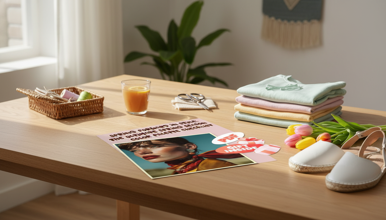
If you want a quick way to map colors, outfits, and smart adds, the Spring Forward in Style: The Ultimate Spring Season Color Palette Checklist – Brighten Your Wardrobe with Fresh Spring Colors is designed to help you choose shades you’ll actually rewear—and turn them into simple outfit formulas.
Spring season color palette checklist
- Choose 2–3 neutrals that feel lighter than winter (cream, warm beige, light camel, soft navy, dove gray).
- Add 3–5 core spring colors you’ll repeat often (coral, peach, butter yellow, mint, sky blue, apple green).
- Pick 1–2 accent brights for small doses (turquoise, poppy red, fuchsia, chartreuse).
- Select 1 metallic that flatters your undertone (gold/rose gold for warmer; silver/pewter for cooler; mixed metals for neutral).
- Decide on one print direction that ties the palette together (florals, stripes, gingham, watercolor, or color-blocking).
- Set an outfit ratio: 70% neutral + 30% color for easy mixing; 50/50 for bolder looks.
- Do a quick closet scan: identify 5 items that can be “spring-shifted” with color (white tee, denim jacket, sneakers, light knit, everyday bag).
Mix-and-match spring palette guide
| Palette role | Color ideas | Best with | Easy outfit example |
|---|---|---|---|
| Light neutrals | Cream, warm beige, stone | Denim, pastel tops, gold jewelry | Cream trousers + striped tee + tan sandals |
| Soft cool neutrals | Dove gray, soft navy | Pink, mint, sky blue | Gray skirt + sky-blue blouse + white sneakers |
| Warm brights | Coral, peach, poppy | Cream, light denim, camel | Coral top + light-wash jeans + nude flats |
| Fresh greens | Mint, apple, sage | White, navy, warm beige | White dress + mint cardigan + tan bag |
| Sunlit yellows | Butter, marigold | Denim, cream, chocolate accents | Butter-yellow knit + denim skirt + brown belt |
| Cool brights | Turquoise, cobalt | White, gray, light camel | Turquoise tank + linen blazer + wide-leg pants |
Find your best spring shades in 5 minutes
Start with a fast undertone check: gold jewelry that “melts” into skin often reads warm/neutral, while silver that looks especially crisp often reads cool/neutral. Next, try the “white test”—hold pure white and then cream near your face. If cream smooths your complexion, lean warmer; if pure white sharpens and brightens you, lean cooler.
Then choose a hero color (the one you’ll wear near your face most): lighter, clearer shades often make eyes look brighter and skin look more even. If a shade feels dusty or overly muted, it can flatten spring styling—especially in bright natural light.
For extra inspiration on why certain shades “read” as seasonal, browsing color families and trend reports from the Pantone Color Institute can help you spot the difference between muted vs. clear color stories.
Build a mini spring capsule from what you already own
Need an easy spring-ready base layer? A light blue tee pairs naturally with cream, beige, navy, mint, or coral—try the Calvin Klein Jeans Light Blue Cotton T-shirt for Men as a clean “starter” for brighter spring combinations.
Outfit formulas that make spring colors feel effortless
Shopping checklist: what to add first (and what to skip)
If you’re building a broader plan (beyond spring), a structured system can save time and prevent random purchases. The Budget Style Strategy Bundle for Everyday Looks – 5-in-1 Digital Download is a helpful option for organizing outfits and shopping choices with repeatable rules.
Use the printable checklist to plan colors, outfits, and purchases
Bring your palette notes when you shop to avoid duplicates and keep your color story consistent. Updating it once per season keeps things fresh without starting over. If you’d like a ready-to-use format, you can grab the Spring Forward in Style: The Ultimate Spring Season Color Palette Checklist – Brighten Your Wardrobe with Fresh Spring Colors and fill it in as you do a quick closet scan.
FAQ
How many colors should a spring wardrobe palette include?
A practical range is 2–3 neutrals, 3–5 core colors, and 1–2 accent brights. This keeps outfits mixable while still giving you enough variety to feel “spring refreshed” without overbuying.
What spring colors are most flattering if unsure about undertones?
Soft coral, mint, sky blue, and cream tend to be versatile starting points. Keep saturation moderate and test shades near your face first—if your skin looks clearer and your eyes look brighter, you’re in the right zone.
How can spring colors be worn without looking too bright?
Use the 70/30 rule (mostly neutrals with a pop of color), and keep brights in accessories or shoes. Pair color with light neutrals and denim, or choose softer versions of brighter shades for an easy, wearable look.


Leave a comment